Synnduit Solutions
Logo / Branding / Corporate Identity
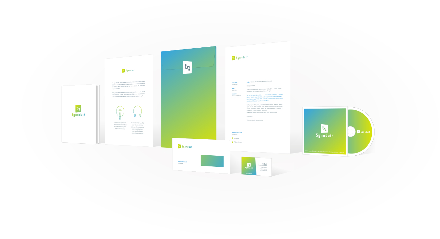
Synnduit Solutions Ltd is an Canadian start-up company engaged in interconnecting databases across platforms. The name Synnduit is a combination of two words: synapse and conduit. Part of the client request was to express the connectivity and connection by logotype. We chose futuristic visual style with reference to modern technology.

When creating a visual style and logotype, we set out to create a unique font called Synnduit, which is both part of the logotype and corporate identity. The font is robust and its formality refers to both the synapses and the conduit that are contained in the company name.

The logotype itself and its morphology refer to technologies. The lying down S-symbol expresses synapses and conduits, generally speaking, interconnecting information using technologies. Morphology of the logo is a combination of straight and circular design elements that convey the high-tech solutions in linking information.
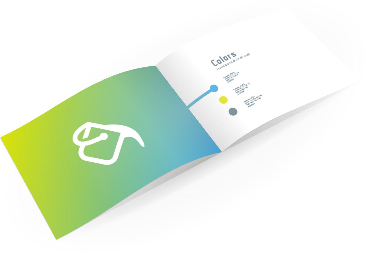
The color of the visual style is based on three colors and their transitions. Transition creates the impression of a high-tech software solution, also refers to the origin of Synnduit Solutions through the color of the polar glow. The color scheme and other visual style patterns are, as with all our logotypes, described in a clear brand guidelines.