Residential house Vrchlického
Logo / Webdesign / Website / Typesetting
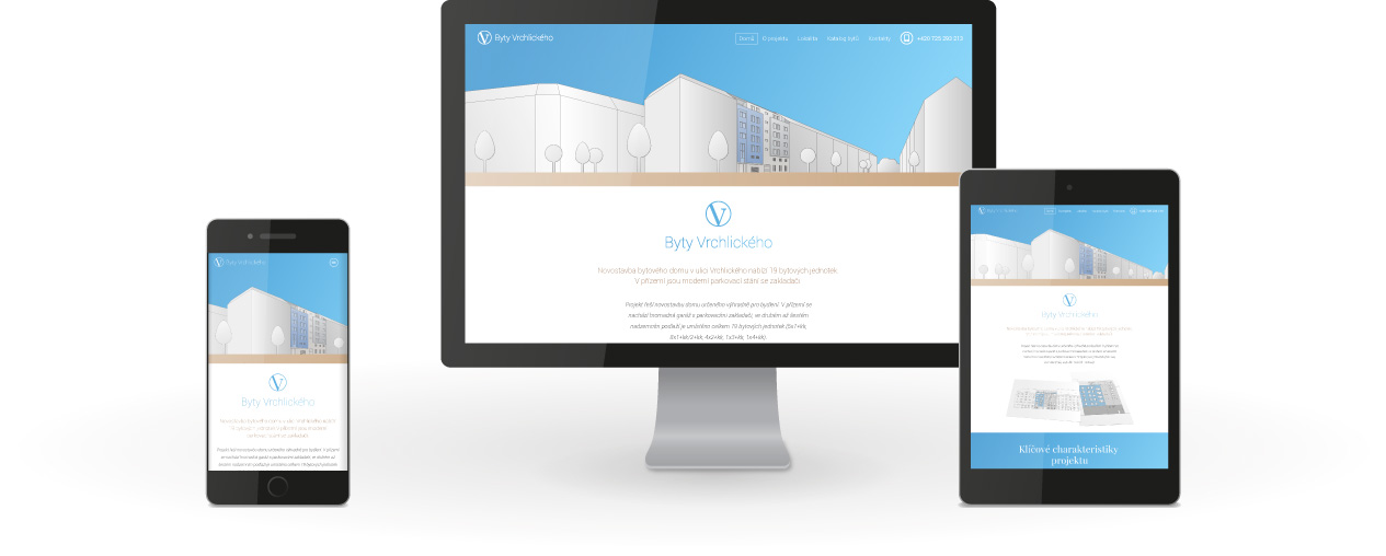
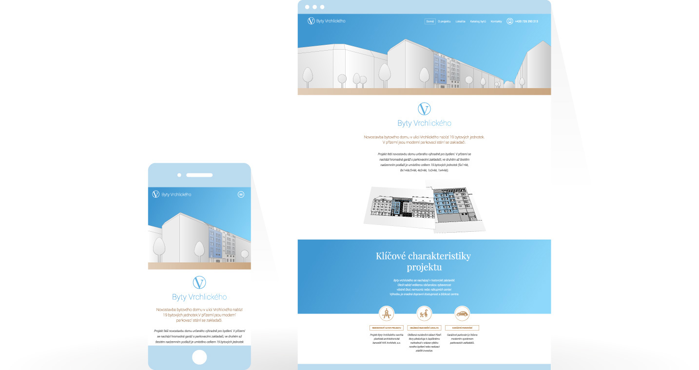
The development project of Vrchlického Apartments combines the comfort of modern living with historical surroundings. We tried to express this fact in the presentation of the project. We have created a fresh, responsive web that uses a specific combination of colors and fonts to honor a tradition.

Website of the project: https://www.bytyvrchlickeho.cz/
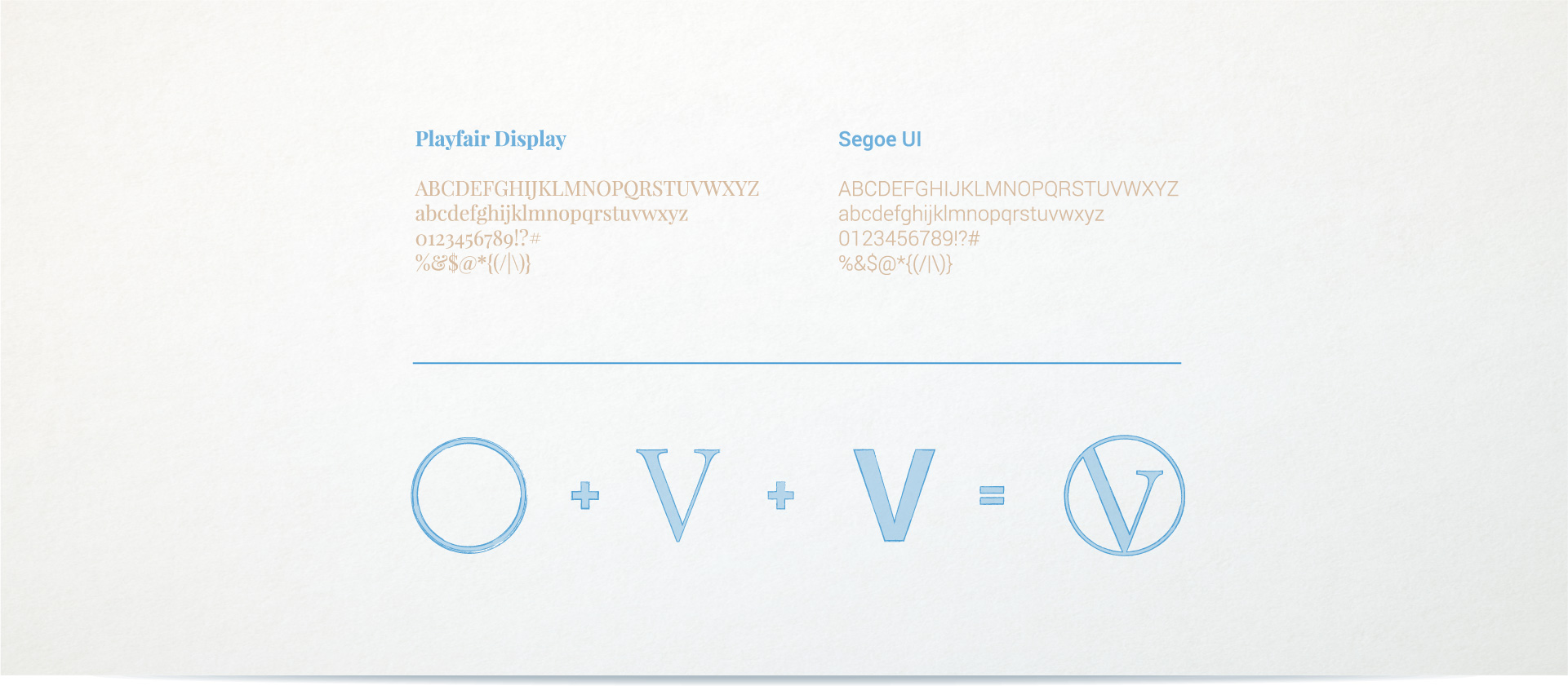
The visual style of the site comes from one serif and the other sans-serif font. This combination expresses the synthesis of old-worldness and modern comfort. A combination of historical buildings around Apartment house Vrchlického and current housing demands.
The logo also comes from a combination of these two fonts and a circle that is a graphic binder of the entire presentation.

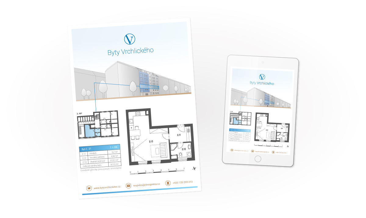
Each project that we work on is addressed in a comprehensive way. Therefore we have also provided a uniform visual style with printed promotional materials, such as apartment cards, banners, or billboards.
