Residential building Na Roudné
Logo / Webdesign / Website / Typesetting
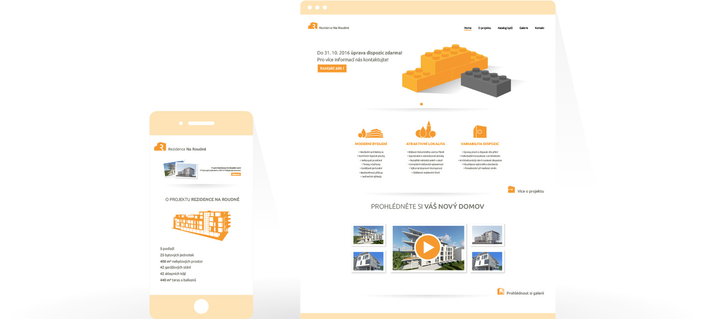
For the Presentation of Residential building Na Roudné, we chose a puristic visual style based on the tradition of architectural craft and the originality of the architectural design itself. The dominant features of the visual are the generously conceived white area, the expression of mass in the surface using pictograms and house diagrams. The result is a responsive webdesign that fits into a unified visual style, including logotype and printed materials.

Website of the project: http://rezidencenaroudne.woop.design/
Logotype for Residential building Na Roudne naturally has only limited durability and does not have to stand out with extraordinary timelessness. Therefore, we have chosen a pictogram that shows the key elements of the apartment building and fits among the other pictograms created for the Residential building Na Roudne.

While working on this project, we also contributed to the refine the visualizations of the architecture itself, in particular, in order to excel its puristic work with matter, so visualization fit into the whole concept of the presentation of the project.

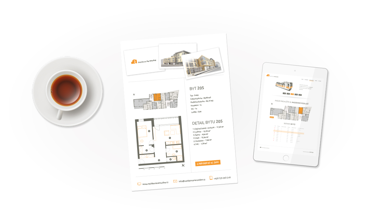
The result is a comprehensive visual style from responsive web design to printed promotional materials that honors the character of architecture and highlights its strengths.
