David Kittel - Notary
Logo / Branding / Corporate Identity

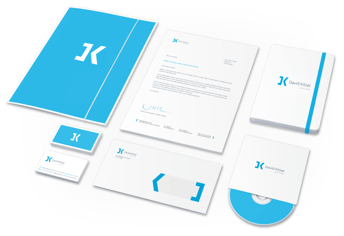
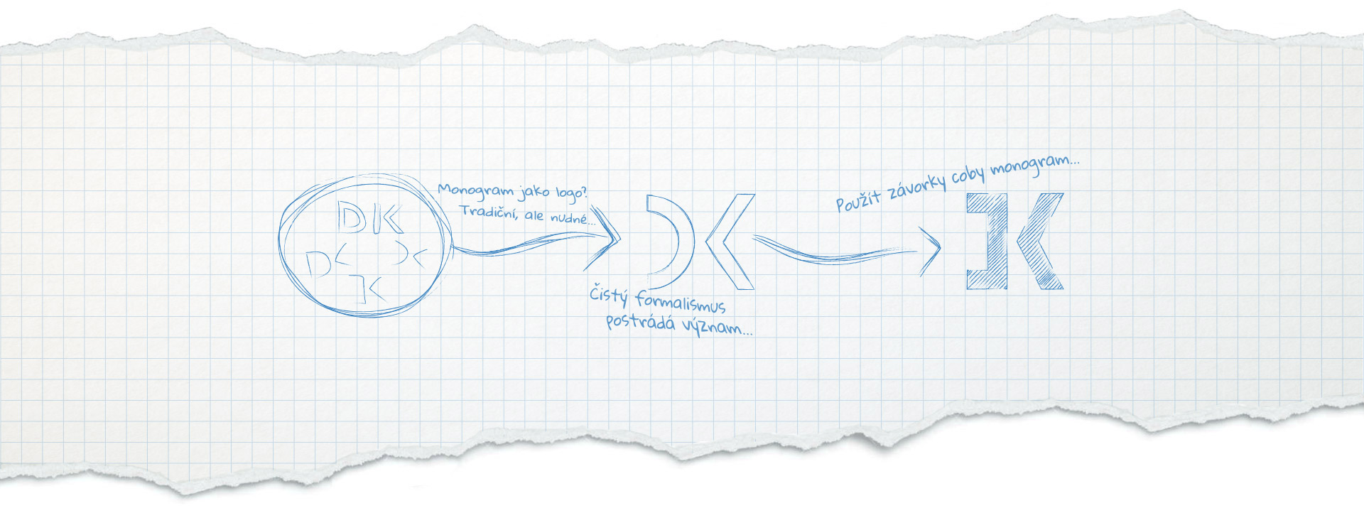
The monogram consists of two parentheses, it can be spread back to these characters and used in a visual style in a variable way. The bracket at the same time acts as an arrow, meaning "call for action", and motivates you to read, navigate the web, or as a guide in the office.

When creating a logo or the whole visual style, a professional logo and branding guidelines is a matter of course.
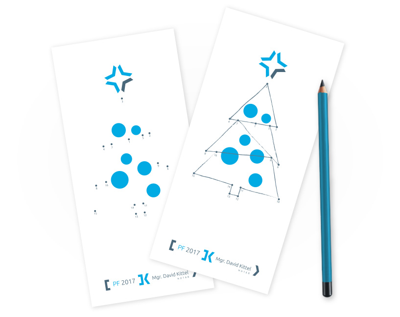
Where does advertising material end? Mostly in a trash bin. Let the children of your clients to play with them and the materials end up clipped under a magnet on the fridge. This PF had to be printed again.

Notary Kittel rides to work on longboard. Because we share the same passion as him, we decided to prepare the original board design.
